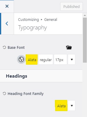
To change the typography of the website, in the Customizer, go to General > Typography.

- The Base Font is the paragraph text that will be used through out the website, try to keep this font simple.
- The Heading Font Family will be used for your headings on the different pages.
The less fonts your website has the better. Fonts slow your website load times down because the website has to fetch the font files to load.
Use 2 fonts at the most. Choose a base font that is a nice easy to read font that suits your style.
Some fonts look great at a base font and a heading font. This font on this website “Lato” works for both base and heading font for example.
Use Your Cover Art Design To Decide Your Heading Font Choice
If you have specific font you use in all the titles of your books, it makes sense to use that for the headings on your website. Lean on the design work that has already been done to make your book cover art great and bring this into your website.
For example look at the website below (one of our AuthorSites templates):

You can see how the heading font on the website matches the book’s title font. They’re actually the same font “Cinzel Decorative”.
Doing this can make your website feel like a digital continuation of your cover design. This creates a smoother user experience for your website visitors and readers. They’ll come to identify this as your unique identity, your author brand.
Changing Font Sizes
Only change font sizes if you absolutely have to. Keep the base font as the smallest font size with the Heading sizes gradually bigger.
Base Font Size
Keep your base font LARGE. 16px is the minimum you should go. 18px or 19px is probably even better. The font size you’re reading right now is 18px for example.
This ensures people actually read the information on your website!
Different Heading Types (H1 Font, H2 Font, H3 Font, etc.)
Your website is structured with different levels of heading font style. Using this is good SEO practice and makes your page content easy to understand for website visitors.
The headings are organized from H1 (most important), down to H6 (least important).
H1 is the title font on the page. There should only ever be one H1 font on each page. There will be a few H2s. Sometimes there may be sub heading H3s under and H2, and so on from there. H4s, H5s, and H6s are less often used.
Don’t worry too much about customizing font sizes if not needed.
Change the size of the base font, H1, H2, and H3 if you need to and you’ll probably be fine. If you do find you’re using H4s, etc. later, you can come back to the customizer and change them then.
Action step: Adjust your global base font and global heading font. If you must, change your font sizes as well.